New Logo
Moderators: 3DO Experience, Devin, Bas, 3DOKid

Re: New Logo
Do it and I'll upload the image!
-
3DO Experience

- 3DO ZONE ADMIN
- Posts: 3686
- Joined: Sun Jun 24, 2007 8:47 am
- Location: U.S.A.
Re: New Logo
Already doing it, just need the font used for "ZERO" 3DO Si, he'll email it to me Monday.
PS. I hope you like the new tagline, I figured "The Only R.E.A.L. 3DO Experience." includes the alternative name and R.E.A.L. which was recently brought up. I secretly liked 3DO Zone as well, hence why I didn't want to vote, plus I would have shortened my name to 3DOExp and I really like the "3DO Experience" maxim bla bla bla
PS. I hope you like the new tagline, I figured "The Only R.E.A.L. 3DO Experience." includes the alternative name and R.E.A.L. which was recently brought up. I secretly liked 3DO Zone as well, hence why I didn't want to vote, plus I would have shortened my name to 3DOExp and I really like the "3DO Experience" maxim bla bla bla
"Wait. You don't have a bag of charcoal in your gaming room???"

Re: New Logo
You really should make the alternate "3DO employees are irritated by our old name forum" too, if only for a laugh. 
Most wanted - Eye of Typhoon, 3DO Magazines issues #14 & #15, Pro Stadium, Defcon 5
-
3DO Experience
- 3DO ZONE ADMIN
- Posts: 3686
- Joined: Sun Jun 24, 2007 8:47 am
- Location: U.S.A.
Re: New Logo
Maybe that will be the April Fool's name. 
This is a sample of the new logo, if people think it's too busy I can use the official symbol. Not really sure if I like it due to the size.

This is a sample of the new logo, if people think it's too busy I can use the official symbol. Not really sure if I like it due to the size.
"Wait. You don't have a bag of charcoal in your gaming room???"
-
NeoGeoNinja
- 3DO ZERO USER
- Posts: 343
- Joined: Sun Apr 14, 2013 5:42 pm
Re: New Logo
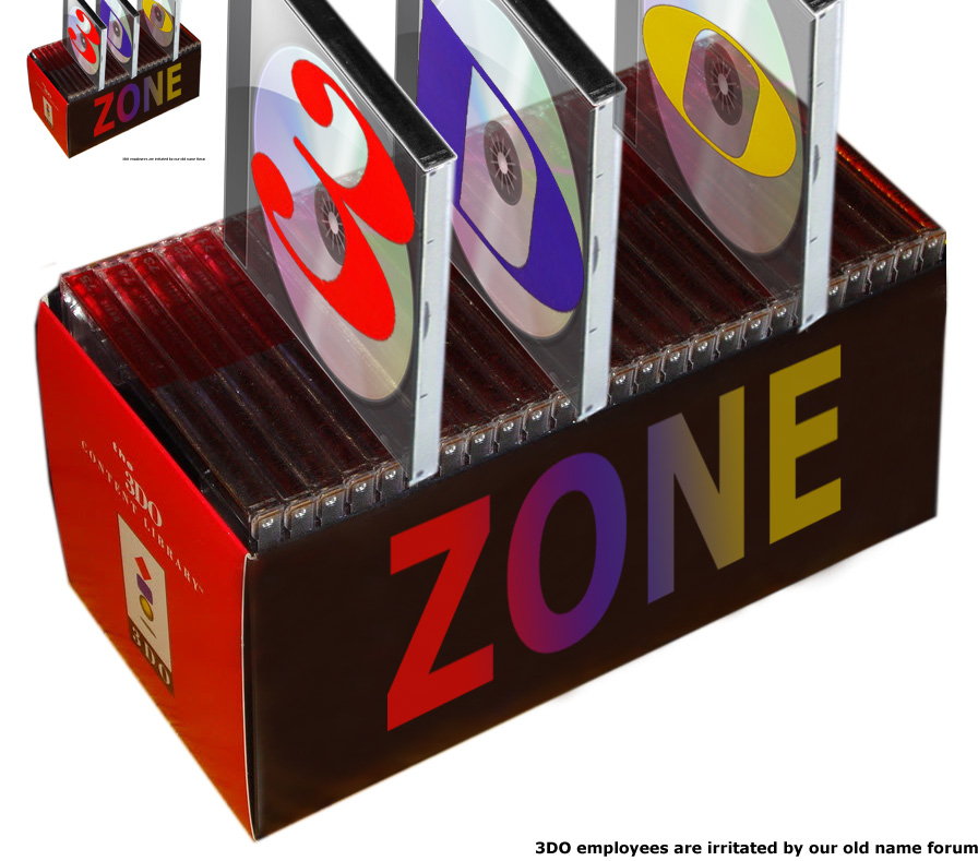
Not to intentionally put a cat amongst any pigeons but I felt like whipping a few ideas up based on the super cool packaging (imo) of the 3DO development packs:
- Attachments
-
- Logo.jpg (173.93 KiB) Viewed 26004 times
Re: New Logo
Looks aces!3DO Experience wrote:
Re: New Logo
All look good, but I like NeoGeoNinja's best (Type C)
Most wanted - Eye of Typhoon, 3DO Magazines issues #14 & #15, Pro Stadium, Defcon 5
-
NeoGeoNinja
- 3DO ZERO USER
- Posts: 343
- Joined: Sun Apr 14, 2013 5:42 pm
Re: New Logo
Cheers Trev.Trev wrote:All look good, but I like NeoGeoNinja's best (Type C)
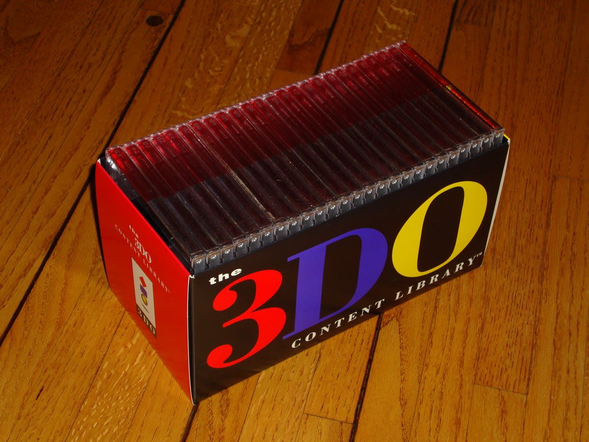
I forgot to link the relevant images:
-
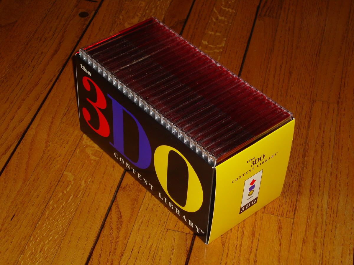
Yeah, that.
I'd never seen it before until recently (thanks bitrate) and I thought it looked super cool
I based the design around that really. Simple, but stylish. I hope...
-
3DO Experience
- 3DO ZONE ADMIN
- Posts: 3686
- Joined: Sun Jun 24, 2007 8:47 am
- Location: U.S.A.
Re: New Logo
I prefer his Type A over C.Trev wrote:All look good, but I like NeoGeoNinja's best (Type C)
"Wait. You don't have a bag of charcoal in your gaming room???"
Re: New Logo
They are all nice. I think the all black background makes the logo easier to read (especially the yellow O) It's a bolder look to, and more eye catching.3DO Experience wrote:I prefer his Type A over C.Trev wrote:All look good, but I like NeoGeoNinja's best (Type C)
Most wanted - Eye of Typhoon, 3DO Magazines issues #14 & #15, Pro Stadium, Defcon 5
-
Martin III

- 3DO ZERO USER
- Posts: 1005
- Joined: Fri Feb 11, 2011 12:32 am
- Location: United States of America
Re: New Logo
Yeah, same here.Trev wrote:They are all nice. I think the all black background makes the logo easier to read (especially the yellow O) It's a bolder look to, and more eye catching.3DO Experience wrote:I prefer his Type A over C.Trev wrote:All look good, but I like NeoGeoNinja's best (Type C)
-
3DO Experience
- 3DO ZONE ADMIN
- Posts: 3686
- Joined: Sun Jun 24, 2007 8:47 am
- Location: U.S.A.
Re: New Logo
Finished, I didn't use a transparency as it really ruined the edges so I made the background match the banner.


I edited the logo in both to match the official symbols as well as the 3 in Ninja's.
PS. Ver A

I edited the logo in both to match the official symbols as well as the 3 in Ninja's.
PS. Ver A
"Wait. You don't have a bag of charcoal in your gaming room???"
-
Austin

- Master Poster & Pricing Expert
- Posts: 1839
- Joined: Sun Dec 20, 2009 11:30 am
- Location: Fairfax, VA
- Contact:
Re: New Logo
It would be awesome if there was a way to use all three and have them alternate at random based on page refreshing or something.
Re: New Logo
This one here.3DO Experience wrote:
Most wanted - Eye of Typhoon, 3DO Magazines issues #14 & #15, Pro Stadium, Defcon 5
-
3DOKid

- 3DO ZONE ADMIN
- Posts: 4683
- Joined: Sat Jan 13, 2007 4:21 pm
- Location: Cambridgeshire, UK
- Contact:
Re: New Logo
Agreed.Trev wrote:This one here.3DO Experience wrote:
-
knightintosh
- 3DO ZERO USER
- Posts: 199
- Joined: Thu May 26, 2011 12:16 am
- Location: Whitehead, Northern Ireland
- Contact:
Re: New Logo
I agree with this too, though I do like all three, but 'A' just wins out for me, not sure why... brighter and more welcoming. That doesn't make sense. I should've just said "aye, I agree".3DO Experience wrote:I prefer his Type A over C.Trev wrote:All look good, but I like NeoGeoNinja's best (Type C)

Re: New Logo
I like A. It just seems to be the friendliest.
-
3DO Experience
- 3DO ZONE ADMIN
- Posts: 3686
- Joined: Sun Jun 24, 2007 8:47 am
- Location: U.S.A.
Re: New Logo
Here's version A. I had to add a little bit of shadow to 3DO as it clashed some.
Now that I see the four of them together I see why people liked this one. I really dislike the one with the images in the logo. It looks good when it's huge but kinda ugly so small.
Now that I see the four of them together I see why people liked this one. I really dislike the one with the images in the logo. It looks good when it's huge but kinda ugly so small.
"Wait. You don't have a bag of charcoal in your gaming room???"
-
NeoGeoNinja
- 3DO ZERO USER
- Posts: 343
- Joined: Sun Apr 14, 2013 5:42 pm
Re: New Logo
Ah... it's not though, is it?3DO Experience wrote:Here's version A...
It's actually an edited version of C without the black box. I can tell because the blue in the D is 'out' (as per intended on black) and the 3DO logo is disproportionate to the height of the logo. Eh?
I hadn't actually given my opinion on which I like best out of the 3, but it was also Type A.
I'll create a proper shadowed version and upload it tomorrow to ponder over.
Incidentally, I liked the Genestealer in the blue 'TV' part of the logo. Thought that was a nice touch
-
3DO Experience
- 3DO ZONE ADMIN
- Posts: 3686
- Joined: Sun Jun 24, 2007 8:47 am
- Location: U.S.A.
Re: New Logo
Yeah it's an edit, I cut out the top and replaced it with the official characters. It was easier than just cutting the black out and trying to make the edges look good.
"Wait. You don't have a bag of charcoal in your gaming room???"
Re: New Logo
The grey background looks nearly white on my computer ... it doesn't stand out at all, and the yellow O in 3DO looks pretty poor. The black looks much better imho.
Most wanted - Eye of Typhoon, 3DO Magazines issues #14 & #15, Pro Stadium, Defcon 5
-
NeoGeoNinja
- 3DO ZERO USER
- Posts: 343
- Joined: Sun Apr 14, 2013 5:42 pm
Re: New Logo
Hmmm. I think you're in need of some contrast adjustments Trev!Trev wrote:The grey background looks nearly white on my computer ... it doesn't stand out at all, and the yellow O in 3DO looks pretty poor. The black looks much better imho.

Re: New Logo
*not be seriously


from desktop:
Last edited by NikeX on Thu Aug 15, 2013 6:22 pm, edited 1 time in total.
Re: New Logo
that's the one3DO Experience wrote:
-
NeoGeoNinja
- 3DO ZERO USER
- Posts: 343
- Joined: Sun Apr 14, 2013 5:42 pm
Re: New Logo
Finally made some updates to the original 'Type A' logo.
3x shadow variants, basically:
3x shadow variants, basically:
- Attachments
-
- Logo2.jpg (215.06 KiB) Viewed 25811 times
Re: New Logo
Sorry ... even with your revisions, I still don't care for the boring grey color scheme.NeoGeoNinja wrote:Hmmm. I think you're in need of some contrast adjustments Trev!Trev wrote:The grey background looks nearly white on my computer ... it doesn't stand out at all, and the yellow O in 3DO looks pretty poor. The black looks much better imho.
Most wanted - Eye of Typhoon, 3DO Magazines issues #14 & #15, Pro Stadium, Defcon 5
-
3DO Experience
- 3DO ZONE ADMIN
- Posts: 3686
- Joined: Sun Jun 24, 2007 8:47 am
- Location: U.S.A.
Re: New Logo
Well the boring grey is the top of the screen where our now old logo is. Also I did some samples in the size they would be.Trev wrote:Sorry ... even with your revisions, I still don't care for the boring grey color scheme.
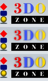
I think your type Z stands out the best.
Please note these are just quickly tossed together, anything final would have better geometry.
"Wait. You don't have a bag of charcoal in your gaming room???"
Re: New Logo
Haven't you heard? The grey color offends former 3DO employees, since it was the color of the original Playstation.3DO Experience wrote:Well the boring grey is the top of the screen where our now old logo is.Trev wrote:Sorry ... even with your revisions, I still don't care for the boring grey color scheme.
Most wanted - Eye of Typhoon, 3DO Magazines issues #14 & #15, Pro Stadium, Defcon 5
-
3DOKid
- 3DO ZONE ADMIN
- Posts: 4683
- Joined: Sat Jan 13, 2007 4:21 pm
- Location: Cambridgeshire, UK
- Contact:
Re: New Logo
Droll, very droll.
Trev wrote:Haven't you heard? The grey color offends former 3DO employees, since it was the color of the original Playstation.3DO Experience wrote:Well the boring grey is the top of the screen where our now old logo is.Trev wrote:Sorry ... even with your revisions, I still don't care for the boring grey color scheme.